이번 포스팅에서는 openpyxl을 이용하여 바 차트(Bar Chart, 막대 그래프) 그리는 방법을 알아보고자 한다.
Bar Chart
- 목차 -
1. Bar Chart
1) 수직, 수평 바 차트
openpyxl에서는 BarChart를 이용하여 바 차트(Bar Chart, 막대 그래프)를 만들 수 있다. 아래 코드를 통해 사용법을 알 수 있다.
코드 설명은 Bar Chart와 관련된 부분을 중점적으로 하며 나머지는 주석을 참고하면 된다.
from openpyxl import Workbook
from openpyxl.chart import BarChart, Reference

wb = Workbook(write_only=True)
ws = wb.create_sheet()

## 데이터 생성
rows = [
    ('Number', 'Batch 1', 'Batch 2'),
    (2, 10, 30),
    (3, 40, 60),
    (4, 50, 70),
    (5, 20, 10),
    (6, 10, 40),
    (7, 50, 30),
]

## 데이터 삽입
for row in rows:
    ws.append(row)

## 바차트 생성
chart1 = BarChart()
chart1.type = "col" ## 수직 바차트
chart1.style = 10 ## 차트 스타일 1~48
chart1.title = "Bar Chart" ## 제목
chart1.y_axis.title = 'Test Number' ## y축 라벨
chart1.x_axis.title = 'Sample Length' ## x축 라벨

## 시각화 대상 데이터 범위 지정
data = Reference(ws, min_col=2, min_row=1, max_row=7, max_col=3)
chart1.add_data(data, titles_from_data=True) ## 데이터 등록
cats = Reference(ws, min_col=1, min_row=2, max_row=7) ## 범주형 데이터 범위
chart1.set_categories(cats) ## 범주형 데이터 설정
chart1.width = 12 ## 차트 폭
chart1.height = 7 ## 차트 높이

## 막대 색상
s1 = chart1.series[0]
s1.graphicalProperties.solidFill = 'ff9900' ## 막대 색상
s2 = chart1.series[1]
s2.graphicalProperties.solidFill = '339944' ## 막대 색상

ws.add_chart(chart1, "A10") ## A10에 차트 삽입

chart2 = BarChart()
chart2.style = 11
chart2.type = "bar" ## 수평 바차트
chart2.title = "Horizontal Bar Chart" ## 타이틀
chart2.y_axis.title = 'Test Number' ## y축 라벨
chart2.x_axis.title = 'Sample Length' ## x축 라벨
chart2.add_data(data, titles_from_data=True) ## 데이터 등록
chart2.set_categories(cats) ## 범주형 데이터 설정
ws.add_chart(chart2, "I10") ## I10에 차트 삽입
wb.save("bar01.xlsx")
line 23~30
BarChart 클래스를 생성하고 type 메서드를 통해 수직 또는 수평으로 그릴지 결정한다. col은 수직, bar는 수평 바 차트를 그리게 된다. 그리고 차트 스타일, 타이틀과 x, y축 라벨 그리고 차트 크기를 설정한다. 차트 스타일은 1~48의 정수를 입력하며 각 스타일은 아래에서 소개한다.
line 33~36
Reference 클래스를 통해 바 차트를 그리는 참조 데이터를 결정한다. 바 차트는 범주형 데이터를 축으로 하므로 이를 따로 지정한 뒤 set_categories에 넘겨줘야 한다.
line 39~42
막대 색상을 결정한다. add_data를 통해 등록한 데이터 칼럼 개수 만큼 series가 생성되어 있는데 이를 고려하여 인덱스로 접근해줘야 한다. 그리고 각 series별로 graphicalProperties.solidFill을 이용하여 막대 색상을 적용한다.

2) 스택 바 차트
이번엔 스택 바 차트를 그려보자. 아래 코드는 openpyxl 에서 제공하는 4가지 종류의 스택 바 차트를 그린 것이다.
wb = Workbook(write_only=True)
ws = wb.create_sheet()

rows = [
    ('Number', 'Batch 1', 'Batch 2'),
    (2, 10, 30),
    (3, 40, 60),
    (4, 50, 70),
    (5, 20, 10),
    (6, 10, 40),
    (7, 50, 30),
]


for row in rows:
    ws.append(row)

stack_type = ['stacked', 'standard', 'clustered', 'percentStacked']
for i, st in enumerate(stack_type):
    ## 바차트 생성
    chart1 = BarChart()
    chart1.type = "col" ## 수직 바차트
    chart1.style = 40 ## 차트 스타일 1~48
    chart1.title = f'{st}' ## 제목
    chart1.y_axis.title = 'Test Number' ## y축 라벨
    chart1.x_axis.title = 'Sample Length' ## x축 라벨

    chart1.grouping = st ## 스택 바 종류
    chart1.overlap = 100 ## 각 막대간 오버랩 정도 스택은 100으로 설정해야 깔끔하다.

    ## 시각화 대상 데이터 범위 지정
    data = Reference(ws, min_col=2, min_row=1, max_row=7, max_col=3)
    chart1.add_data(data, titles_from_data=True) ## 데이터 등록
    cats = Reference(ws, min_col=1, min_row=2, max_row=7) ## 범주형 데이터 범위
    chart1.set_categories(cats) ## 범주형 데이터 설정

    if i%2 == 0:
        ws.add_chart(chart1, f"A{10+13*(i//2)}")
    else:
        ws.add_chart(chart1, f"I{10+13*(i//2)}")

wb.save("stack_bar.xlsx")
line 28~29
사용법은 앞에서와 비슷하며 다만 grouping이라는 필드에 스택 바 차트 종류를 넣어줘야 한다. 스택 바 차트 종류는 'stacked', 'standard', 'clustered', 'percentStacked'이다. 또한 overlap 필드는 각 그룹 간 막대의 오버랩 정도를 나타내는데 완벽하게 오버랩되도록 100을 넣어줘야 한다. 그래야 깔끔하다.

2. 3d Bar Chart
openpyxl에서는 3차원 바 차트(막대 그래프)도 지원한다. BarChart3D 클래스를 이용하면 3차원 바 차트를 그릴 수 있다. 코드는 앞에서 살펴본 것과 동일하므로 설명은 생략한다.
from openpyxl import Workbook
from openpyxl.chart import Reference, BarChart3D

wb = Workbook()
ws = wb.active

## 데이터 생성
rows = [
    (None, 2013, 2014),
    ("Apples", 5, 4),
    ("Oranges", 6, 2),
    ("Pears", 8, 3)
]

## 데이터 삽입
for row in rows:
    ws.append(row)

## 연속형 데이터, 범주형 데이터 설정
data = Reference(ws, min_col=2, min_row=1, max_col=3, max_row=4)
titles = Reference(ws, min_col=1, min_row=2, max_row=4)

chart = BarChart3D() ## 바 차트 생성
chart.title = "3D Bar Chart" ## 타이틀
chart.add_data(data=data, titles_from_data=True) ## 데이터 등록
chart.set_categories(titles) ## 범주형 데이터 설정

ws.add_chart(chart, "E5") ## E5에 차트 삽입
wb.save("bar3d.xlsx")

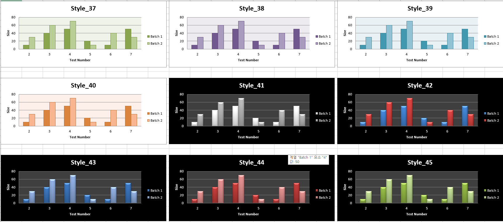
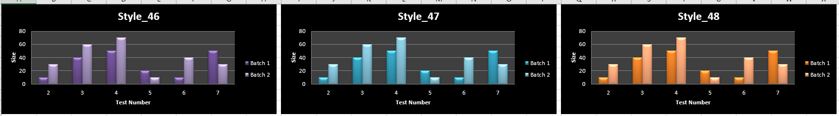
3. Style(1~48)
여기서는 1~48까지 사전에 설정된 차트 스타일을 소개한다. 참고하여 원하는 스타일을 고르면 된다.


- 참고 자료 -
Bar and Column Charts - https://openpyxl.readthedocs.io/en/stable/charts/bar.html
'프로그래밍 > 엑셀(Excel)' 카테고리의 다른 글
| [OpenPyXL] 차트 그리기 - (4) Pie Chart, Doughnut Chart (0) | 2022.10.29 |
|---|---|
| [OpenPyXL] 차트 그리기 - (3) Scatter Chart, Bubble Chart (0) | 2022.10.29 |
| [OpenPyXL] 차트 그리기 - (1) Line Chart (0) | 2022.10.27 |
| [OpenPyXL] 9. 데이터를 다 포함하도록 셀 폭 조절하기 (0) | 2022.10.06 |
| [OpenPyXL] 8. 셀 안에 데이터 막대(Data Bar) 삽입하기 (feat. FormatObject, DataBar, Rule) (0) | 2022.10.06 |


댓글