여러분~ 안녕하십니까?! 꽁냥이입니다.
산포도는 두 변수의 상관관계, 분포를 시각적으로 보여주는 그림인데요. 하지만 단순히 산포도 하나만으로는 개별 변수의 분포를 보기가 어려울 수 있는데요. 이때 개별 변수의 히스토그램을 추가한다면 두 변수의 상관관계와 분포뿐만 아니라 개별 변수의 분포도 볼 수 있을 것입니다.
따라서 이번 포스팅에서는 Matplotlib을 이용하여 산포도에 히스토그램을 추가하는 방법을 알아보도록하겠습니다. Matplolit을 이용하여 산포도, 히스토그램을 그리는 방법에 대해서 포스팅한 것이 있으니 잘 모르시는 분들은 보고 오시는 것을 추천드려요.
[산점도(Scatter Plot)] 1. Matplotlib을 이용하여 산점도 그리기
[산점도(Scatter Plot)] 2. Matplotlib을 이용하여 산점도 멋지게 만들어보기
[히트 맵(Heat Map)] 1. 히트 맵 그리기 - 기본
여기서 다루는 내용은 다음과 같습니다.
1. 산포도에 히스토그램 추가하기
산포도에 히스토그램을 추가하기 위해선 다음과 같이 세개의 axes를 만들어줘야 합니다. 여기서 axes는 x축과 y축으로 둘러싸인 공간이라고 생각하시면 됩니다. 이해를 돕기 위해 아래 그림을 살펴보겠습니다.
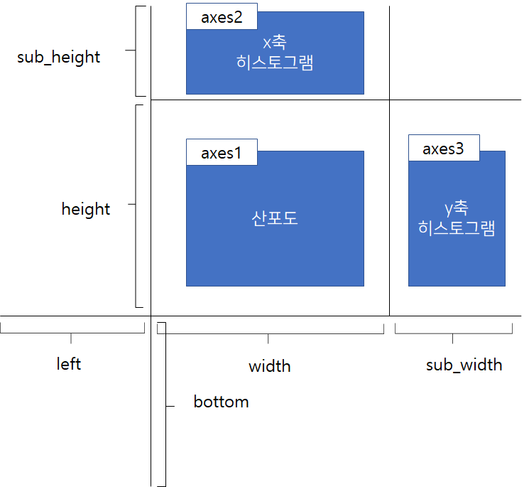
먼저 left 와 bottom은 axes1가 그려질 좌측 하단 꼭지점이라고 생각하시면 됩니다. 이 꼭지점으로 부터 폭 width, 높이 height 만큼의 공간을 갖는 axe1을 만들고 이 안에 산포도를 그릴 겁니다. 다음으로 bottom+height, left을 꼭지점으로 시작해서 폭 width, 높이 sub_height 만큼의 공간을 갖는 axes2를 만들고 여기에는 x 변수의 히스토그램을 그릴 겁니다. axe3도 비슷한 원리로 만들어지게 되며 여기에 y변수 히스토그램을 만들 겁니다.
이제 원리는 알았으니 Matplotlib을 이용하여 구현해볼게요~ 먼저 필요한 모듈을 임포트 해줍니다.
import numpy as np
import matplotlib.pyplot as plt
import matplotlib.colors as mcl
import pandas as pd
import seaborn as sns
from scipy.stats import multivariate_normal
from matplotlib.colors import LinearSegmentedColormap
이제 산포도에 히스토그램을 추가하는 전체 코드를 살펴보겠습니다. 여기서 설명하지 않는 부분은 주석으로 대체하겠습니다.
np.random.seed(2021)
## 데이터 생성
x = np.random.randn(1000)
y = np.random.randn(1000)
# Axes 크기 설정
left, width = 0, 0.6
bottom, height = 0, 0.6
sub_height = 0.2
sub_width = 0.2
spacing = 0.005
rect_scatter = [left, bottom, width, height] ## 산포도가 그려질 Axes
rect_histx = [left, height+spacing, width, sub_height] ## x축 히스토그램이 그려질 Axes
rect_histy = [width + spacing, bottom, sub_width, height] ## y축 히스토그램이 그려질 Axes
fig = plt.figure(figsize=(8, 8))
fig.set_facecolor('white')
# 3개 Axes 생성
ax_scatter = plt.axes(rect_scatter)
ax_scatter.tick_params(direction='in', top=True, right=True) ## 눈금은 Axes 안쪽으로 설정
ax_histx = plt.axes(rect_histx)
ax_histx.tick_params(direction='in', labelbottom=False)
ax_histy = plt.axes(rect_histy)
ax_histy.tick_params(direction='in', labelleft=False)
ax_scatter.scatter(x, y) ## 산포도 생성
## 산포도 x, y축 limit 설정
binwidth = 0.25
lim = np.ceil(np.abs([x, y]).max() / binwidth) * binwidth
ax_scatter.set_xlim((-lim, lim))
ax_scatter.set_ylim((-lim, lim))
## 각 Axes에 히스토그램 그리기
bins = np.arange(-lim, lim + binwidth, binwidth)
ax_histx.hist(x, bins=bins) ## x축 히스토그램
ax_histy.hist(y, bins=bins, orientation='horizontal') ## y축 히스토그램
## 히스토그램 x & y limit 설정
ax_histx.set_xlim(ax_scatter.get_xlim())
ax_histy.set_ylim(ax_scatter.get_ylim())
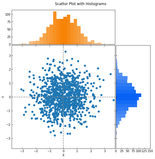
plt.suptitle('Scattor Plot with Histograms',x=0.4, y=0.85)
ax_scatter.set_xlabel('X') ## 산포도 x 라벨
ax_scatter.set_ylabel('Y') ## 산포도 y 라벨
plt.show()
line 8~16
앞에서 살펴본 axes 3개를 만들기 위한 시작점, 높이와 폭을 설정하고 리스트로 만들어줍니다. 이때 히스토그램을 그리는 axes와 산포도를 그리는 axes를 분리하기 위한 공간 spacing을 설정해줍니다(line 12).
line 22~27
시작점, 높이와 폭을 설정했지만 아직 공간을 만든 것은 아닙니다. 공간은 plt.axes를 사용하여 만들어줍니다. plt.axes는 좌측 시작 위치, 바닥 시작위치, 폭, 높이를 원소로 갖는 리스트를 인자로 받습니다. 그리고 각 공간에서 눈금이 겹치지 않도록 눈금을 안쪽으로 설정합니다.
line 29~49
이제 각 axes에 산포도와 히스토그램 2개를 그려줍니다. 이때 y변수 히스토그램은 수평으로 그려주도록 합니다(line 40).
위 코드를 실행해보세요.

산포도에 히스토그램이 잘 추가된 것을 확인할 수 있습니다.
2. 좀 더 멋지게 꾸미기
1. 그룹 변수가 없는 경우
여기에서는 앞에서 생성한 데이터를 이용하여 앞의 결과를 좀 더 꾸며 보도록 하겠습니다. 꾸미는 요소는 다음과 같습니다.
1. y변수 히스토그램에서 x축 눈금을 0, 50, 100이 아닌 0, 25, 50, 75, 100으로 좀 더 세분화
2. 산포도에 눈금선 추가
3. 히스토그램에 그라데이션 적용
사실 뭔가 새로운 것은 아니고 이전 포스팅에서 다룬 내용을 여기에서 응용한 것입니다. 먼저 히스토그램에 그라데이션을 적용하는 함수를 정의합니다. 히스토그램에 그라데이션을 적용하는 부분은 이전 포스팅에서 다루었으므로 설명은 주석으로 대체합니다.
def apply_gradient(hist, hv):

    bins, patches = hist[1], hist[2]
    bin_centers = 0.5*(bins[:-1]+bins[1:]) ## 막대의 위치에 따라서 색 그라디언트를 입힌다.

    ## 막대의 위치를 0~1로 만들어준다.
    col = bin_centers - min(bin_centers)
    col /= max(col)

    ## hsv 색상을 rgb 색상으로 바꿔준다.
    h = hv[0]
    v = hv[1]
    cv = [mcl.hsv_to_rgb((h*1/(2*180),0.2,v/100)),
          mcl.hsv_to_rgb((h*1/(2*180),1,v/100)),
          mcl.hsv_to_rgb((h*1/(2*180),0.2,v/100))]

    cmap=LinearSegmentedColormap.from_list('field_cmap', cv, N=256,gamma=1)

    for c, p in zip(col, patches):
        p.set_facecolor(cmap(c))
이제 전체 코드를 살펴보겠습니다. 코드는 앞에서 본 것과 거의 동일하며 꾸미는 요소만 설명드릴게요.
np.random.seed(2021)

## 데이터 생성
x = np.random.randn(1000)
y = np.random.randn(1000)

# Axes 크기 설정
left, width = 0, 0.6
bottom, height = 0, 0.6
sub_height = 0.2
sub_width = 0.2
spacing = 0.005

rect_scatter = [left, bottom, width, height] ## 산포도가 그려질 Axes
rect_histx = [left, height+spacing, width, sub_height] ## x축 히스토그램이 그려질 Axes
rect_histy = [width + spacing, bottom, sub_width, height] ## y축 히스토그램이 그려질 Axes

fig = plt.figure(figsize=(8, 8))
fig.set_facecolor('white')

# 3개 Axes 생성
ax_scatter = plt.axes(rect_scatter)
ax_scatter.tick_params(direction='in', top=True, right=True) ## 눈금은 Axes 안쪽으로 설정
ax_histx = plt.axes(rect_histx)
ax_histx.tick_params(direction='in', labelbottom=False)
ax_histy = plt.axes(rect_histy)
ax_histy.tick_params(direction='in', labelleft=False)

ax_scatter.scatter(x, y) ## 산포도 생성

## 산포도 x, y축 limit 설정
binwidth = 0.25
lim = np.ceil(np.abs([x, y]).max() / binwidth) * binwidth
ax_scatter.set_xlim((-lim, lim))
ax_scatter.set_ylim((-lim, lim))

## 중앙 눈금선 생성
line_config = dict()
line_config['linestyle'] = '--'
line_config['color'] = 'gray'

ax_scatter.axhline(0, **line_config)
ax_scatter.axvline(0, **line_config)

## 각 Axes에 히스토그램 그리기
bins = np.arange(-lim, lim + binwidth, binwidth)
histx = ax_histx.hist(x, bins=bins)
apply_gradient(histx, hv=(31, 97)) ## x축 히스토그램에 그라데이션 입히기
histy = ax_histy.hist(y, bins=bins, orientation='horizontal')
apply_gradient(histy, hv=(217, 96)) ## y축 히스토그램에 그라데이션 입히기
histy_xtick_min = ax_histy.get_xticks().min()
histy_xtick_max = ax_histy.get_xticks().max()

## y축 히스토그램에 x축 눈금 세분화
ax_histy.set_xticks(np.arange(histy_xtick_min, histy_xtick_max+25, 25))

ax_histx.set_xlim(ax_scatter.get_xlim()) ## 히스토그램 x & y limit 설정
ax_histy.set_ylim(ax_scatter.get_ylim())

plt.suptitle('Scattor Plot with Histograms',x=0.4, y=0.85)
ax_scatter.set_xlabel('X') ## 산포도 x 라벨
ax_scatter.set_ylabel('Y') ## 산포도 y 라벨
plt.show()
line 38~43
중앙에 눈금선을 추가합니다. 라인 색상은 회색이며 스타일은 점선으로 설정했습니다.
line 48, 50
히스토그램에 그라데이션을 적용합니다.
line 55
y 변수 히스토그램의 x축 눈금을 세분화합니다.
코드를 실행해보세요~
아까보다 좀 더 멋진(?) 그림을 얻을 수 있습니다.
2. 그룹 변수가 있는 경우
이번에는 그룹 변수(또는 범주형 변수)가 섞여 있는 경우를 다루어 보도록 하겠습니다. 어렵지 않습니다. 앞에서 살펴본 거에서 코드 몇 줄만 더 추가하면 됩니다. 먼저 데이터를 만들어줄게요. 꽁냥이는 그룹이 3개인 경우를 고려했습니다.
np.random.seed(20210707)
data_num = 500
group = [1,2,3]
x = []
y = []
group_list = []
for g in group:
    sample = multivariate_normal.rvs(mean=np.array([g,g*(-1)**g]),
                            cov=np.array([[g,0.5/g],[0.5/g,g]]), size=data_num)

    x += list(sample[:,0])
    y += list(sample[:,1])
    group_list += [g]*data_num

df = pd.DataFrame()
df['x'] = x
df['y'] = y
df['Group'] = group_list

이제 코드를 살펴볼게요. 원리는 동일하므로 달라진 부분만 설명드리겠습니다.
# colors
colors = sns.color_palette('hls',len(df['Group'].unique()))
color_map = dict(zip(df['Group'].unique(), colors))

# Axes 크기 설정
left, width = 0, 0.6
bottom, height = 0, 0.6
sub_height = 0.2
sub_width = 0.2
spacing = 0.005

rect_scatter = [left, bottom, width, height] ## 산포도가 그려질 Axes
rect_histx = [left, height+spacing, width, sub_height] ## x축 히스토그램이 그려질 Axes
rect_histy = [width + spacing, bottom, sub_width, height] ## y축 히스토그램이 그려질 Axes

fig = plt.figure(figsize=(8, 8))
fig.set_facecolor('white')

# 3개 Axes 생성
ax_scatter = plt.axes(rect_scatter)
ax_scatter.tick_params(direction='in', top=True, right=True) ## 눈금은 Axes 안쪽으로 설정
ax_histx = plt.axes(rect_histx)
ax_histx.tick_params(direction='in', labelbottom=False)
ax_histy = plt.axes(rect_histy)
ax_histy.tick_params(direction='in', labelleft=False)

ax_scatter.scatter(df['x'], df['y'], c=df['Group'].map(color_map)) ## 산포도 생성

## 산포도 x, y축 limit 설정
binwidth = 0.25
lim = np.ceil(np.abs([x, y]).max() / binwidth) * binwidth
ax_scatter.set_xlim((-lim, lim))
ax_scatter.set_ylim((-lim, lim))

line_config = dict()
line_config['linestyle'] = '--'
line_config['color'] = 'gray'

ax_scatter.axhline(0, **line_config)
ax_scatter.axvline(0, **line_config)
## 각 Axes에 히스토그램 그리기
bins = np.arange(-lim, lim + binwidth, binwidth)
for g in df['Group'].unique():
    x = df.query('Group == @g')['x']
    y = df.query('Group == @g')['y']
    histx = ax_histx.hist(x, bins=bins, color=color_map[g], alpha=0.7)
    histy = ax_histy.hist(y, bins=bins, orientation='horizontal',
                          color=color_map[g], alpha=0.7)

histy_xtick_min = ax_histy.get_xticks().min()
histy_xtick_max = ax_histy.get_xticks().max()
ax_histy.set_xticks(np.arange(histy_xtick_min, histy_xtick_max+25, 25))

ax_histx.set_xlim(ax_scatter.get_xlim()) ## 히스토그램 x & y limit 설정
ax_histy.set_ylim(ax_scatter.get_ylim())

ax_scatter.set_xlabel('X') ## 산포도 x 라벨
ax_scatter.set_ylabel('Y') ## 산포도 y 라벨
plt.show()
line 2~3
그룹별 색상을 설정합니다.
line 27
scatter에서 c인자에 그룹별 색상을 지정해줍니다.
line 43~48
그룹별로 히스토그램을 그리기 위해선 그룹 개수만큼 히스토그램을 그려주어야 합니다.
이제 코드를 실행해보세요.

그림이 멋지게 완성되었습니다. 짝짝짝~!!
이번 포스팅에서는 산포도에 히스토그램을 그려보는 방법에 대해서 알아보았습니다. 이 부분도 시각화에 많이 사용될 수 있으니 알아두시면 반드시 도움이 될 거예요. 다음에도 좋은 주제로 찾아뵐 것을 약속드리며 이상 포스팅 마치겠습니다. 지금까지 꽁냥이의 글 읽어주셔서 감사합니다.

참고자료
https://matplotlib.org/3.1.0/gallery/lines_bars_and_markers/scatter_hist.html
'데이터 분석 > 시각화' 카테고리의 다른 글
| Matplotlib을 이용하여 버블 차트(Bubble Chart) 그리기 (832) | 2021.08.10 |
|---|---|
| Matplotlib을 이용하여 바 차트(Bar Chart)에 선 그래프 추가하기. (857) | 2021.08.05 |
| Matplotlib 서로 다른 y축 적용하기 (1044) | 2021.07.13 |
| Matplotlib을 이용하여 이진 트리(Binary Tree) 시각화 해보기 (853) | 2021.07.11 |
| Matplotlib 메인 눈금(Major Tick) 서브 눈금(Minor Tick) 사용하기 (853) | 2021.06.14 |


댓글