안녕하세요~ 꽁냥이에요.
보통 게임 속 캐릭터의 능력치를 나타낼 때 레이더 차트(Radar chart)를 많이 사용합니다. 여러분들도 많이 보셨을 거예요. 레이더 차트는 스파이더 차트(Spider chart)라고도 불리는데요. 각 변수에 대해서 가질 수 있는 값의 범위가 모두 같고 변수의 개수가 10개 내외인 경우에 레이더 차트(또는 스파이더 차트)를 사용하면 데이터의 특성을 직관적으로 볼 수 있지요.
이번 포스팅에서는 Matplotlib을 이용하여 레이더 차트를 그려보는 방법에 대해서 알아보겠습니다.
※ 주의 사항 ※
해당 내용은 matplotlib 버전 3.2.1 에서 잘 잘동되고 특정 버전 이후로는 잘되지 않는 것으로 확인되었습니다. 관련 내용은 후즈 테크님께서 알려주셨습니다.
파이썬 rader chart 작성법(spider chart)
게임을 하다 보면, 아래 같은 차트를 보게되곤 한다. 한눈에 봐도 어떤 성향을 가졌는지 어떤 분야에 뛰어난지 등을 알 수 있는데, 위의 차트를 rader chart 또는 spider chart 라고 부른다. 해당 차트를
whosetech.tistory.com
1. 데이터 준비
먼저 이번 포스팅에서 필요한 모듈을 임포트하고 데이터를 만들겠습니다.
import matplotlib.pyplot as plt
import pandas as pd
import numpy as np

from math import pi
from matplotlib.path import Path
from matplotlib.spines import Spine
from matplotlib.transforms import Affine2D

## 데이터 준비
df = pd.DataFrame({
'Character': ['Barbarian','Amazon','Necromancer','Sorceress','Paladin'],
'Strength': [10, 5, 3, 2, 7],
'Dexterity': [4, 10, 3, 3, 8],
'Vitality': [9, 9, 7, 7, 8],
'Energy': [4, 4, 10, 10, 6],
'Wisdom': [2, 6, 8, 9, 8]
})
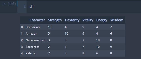
꽁냥이가 어렸을 때 했던 디아블로 2가 생각나서 데이터를 이렇게 만들었어요 ^0^.
2. 레이더 차트 그리기
이제 위의 데이터를 이용하여 레이더 차트를 그려보겠습니다. 아래 코드를 살펴볼게요.
## 따로 그리기
labels = df.columns[1:]
num_labels = len(labels)

angles = [x/float(num_labels)*(2*pi) for x in range(num_labels)] ## 각 등분점
angles += angles[:1] ## 시작점으로 다시 돌아와야하므로 시작점 추가

my_palette = plt.cm.get_cmap("Set2", len(df.index))

fig = plt.figure(figsize=(15,20))
fig.set_facecolor('white')

for i, row in df.iterrows():
    color = my_palette(i)
    data = df.iloc[i].drop('Character').tolist()
    data += data[:1]

    ax = plt.subplot(3,2,i+1, polar=True)
    ax.set_theta_offset(pi / 2) ## 시작점
    ax.set_theta_direction(-1) ## 그려지는 방향 시계방향

    plt.xticks(angles[:-1], labels, fontsize=13) ## x축 눈금 라벨
    ax.tick_params(axis='x', which='major', pad=15) ## x축과 눈금 사이에 여백을 준다.

    ax.set_rlabel_position(0) ## y축 각도 설정(degree 단위)
    plt.yticks([0,2,4,6,8,10],['0','2','4','6','8','10'], fontsize=10) ## y축 눈금 설정
    plt.ylim(0,10)

    ax.plot(angles, data, color=color, linewidth=2, linestyle='solid') ## 레이더 차트 출력
    ax.fill(angles, data, color=color, alpha=0.4) ## 도형 안쪽에 색을 채워준다.

    plt.title(row.Character, size=20, color=color,x=-0.2, y=1.2, ha='left') ## 타이틀은 캐릭터 클래스로 한다.

plt.tight_layout(pad=5) ## subplot간 패딩 조절
plt.show()
레이더 차트를 그리기 위해서는 xy 좌표계가 아닌 극 좌표계를 사용해야 합니다. 극 좌표계는 각도(angle) 축과 반지름(radius) 축으로 이루어져 있습니다.
line 1
각도 축 눈금 라벨이 되는 캐릭터의 능력치 칼럼 이름을 labels에 담았습니다.
line 5~6
레이더 차트는 ax.plot 함수를 이용하여 그릴 수 있습니다. 이때 첫 번째 인자에는 각도 값을 담고 있는 리스트를 넣어줍니다(line 5). 이때 리스트 맨 마지막에는 그래프 선이 시작점으로 되돌아올 수 있게 시작 각도를 추가해주어야 합니다(line 6).
line 16
데이터는 각도 값을 포함하는 리스트의 길이와 같아야 합니다. 각도와 마찬가지로 그래프 선이 시작점으로 되돌아올 수 있도록 시작 데이터 값을 마지막에 추가해주어야 합니다.
line 18
좌표계를 극좌표계로 설정하고 5개를 그리기 위하여 행은 2, 열은 3개인 subplot을 생성했습니다.
line 19
그래프 선이 그려지는 시작점을 12시 방향으로 지정했습니다.
line 20
선이 그려지는 방향을 시계방향으로 지정했습니다.
line 25
반지름 축에 표시할 눈금 라벨의 각도를 설정합니다.
line 30
그래프 선으로 둘러싸인 부분에 색을 채워줍니다.
위 코드를 실행해보세요.
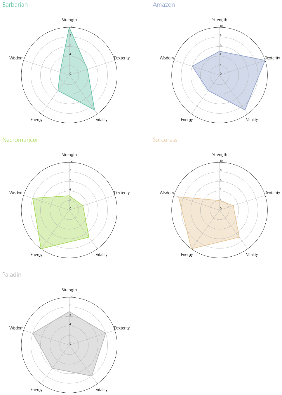
레이더 차트가 각 캐릭터별로 멋지게 나왔어요~!!
이번에는 한 곳에 모아보겠습니다. 코드는 위와 거의 같으므로 주석으로 대체합니다.
## 하나로 합치기
labels = df.columns[1:]
num_labels = len(labels)

angles = [x/float(num_labels)*(2*pi) for x in range(num_labels)] ## 각 등분점
angles += angles[:1] ## 시작점으로 다시 돌아와야하므로 시작점 추가

my_palette = plt.cm.get_cmap("Set2", len(df.index))

fig = plt.figure(figsize=(8,8))
fig.set_facecolor('white')
ax = fig.add_subplot(polar=True)
for i, row in df.iterrows():
    color = my_palette(i)
    data = df.iloc[i].drop('Character').tolist()
    data += data[:1]

    ax.set_theta_offset(pi / 2) ## 시작점
    ax.set_theta_direction(-1) ## 그려지는 방향 시계방향

    plt.xticks(angles[:-1], labels, fontsize=13) ## 각도 축 눈금 라벨
    ax.tick_params(axis='x', which='major', pad=15) ## 각 축과 눈금 사이에 여백을 준다.

    ax.set_rlabel_position(0) ## 반지름 축 눈금 라벨 각도 설정(degree 단위)
    plt.yticks([0,2,4,6,8,10],['0','2','4','6','8','10'], fontsize=10) ## 반지름 축 눈금 설정
    plt.ylim(0,10)

    ax.plot(angles, data, color=color, linewidth=2, linestyle='solid', label=row.Character) ## 레이더 차트 출력
    ax.fill(angles, data, color=color, alpha=0.4) ## 도형 안쪽에 색을 채워준다.

plt.legend(loc=(0.9,0.9))
plt.show()
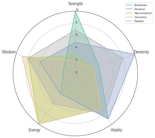
지금까지 본 레이더 차트는 각도 축과 안쪽 그리드 선이 모두 원인 것을 알 수 있는데요. 일반적으로 레이더 차트는 각도 축과 안쪽 그리드 선이 다각형 모양을 하고 있어요. 따라서 이를 바꿔보도록 하겠습니다.
## 하나로 합치기 - 폴리곤
labels = df.columns[1:]
num_labels = len(labels)

angles = [x/float(num_labels)*(2*pi) for x in range(num_labels)] ## 각 등분점
angles += angles[:1] ## 시작점으로 다시 돌아와야하므로 시작점 추가

my_palette = plt.cm.get_cmap("Set2", len(df.index))

fig = plt.figure(figsize=(8,8))
fig.set_facecolor('white')
ax = fig.add_subplot(polar=True)
for i, row in df.iterrows():
    color = my_palette(i)
    data = df.iloc[i].drop('Character').tolist()
    data += data[:1]

    ax.set_theta_offset(pi / 2) ## 시작점
    ax.set_theta_direction(-1) ## 그려지는 방향 시계방향

    plt.xticks(angles[:-1], labels, fontsize=13) ## x축 눈금 라벨
    ax.tick_params(axis='x', which='major', pad=15) ## x축과 눈금 사이에 여백을 준다.
    ax.set_rlabel_position(0) ## y축 각도 설정(degree 단위)
    plt.yticks([0,2,4,6,8,10],['0','2','4','6','8','10'], fontsize=10) ## y축 눈금 설정
    plt.ylim(0,10)

    ax.plot(angles, data, color=color, linewidth=2, linestyle='solid', label=row.Character) ## 레이더 차트 출력
    ax.fill(angles, data, color=color, alpha=0.4) ## 도형 안쪽에 색을 채워준다.

for g in ax.yaxis.get_gridlines(): ## grid line
    g.get_path()._interpolation_steps = len(labels)

spine = Spine(axes=ax,
          spine_type='circle',
          path=Path.unit_regular_polygon(len(labels)))

## Axes의 중심과 반지름을 맞춰준다.
spine.set_transform(Affine2D().scale(.5).translate(.5, .5)+ax.transAxes)

ax.spines = {'polar':spine} ## frame의 모양을 원에서 폴리곤으로 바꿔줘야한다.

plt.legend(loc=(0.9,0.9))
plt.show()
line 31~32
안쪽 그리드 선을 다각형으로 바꾸어 줍니다.
line 34~36
안쪽 그리드 선은 다각형으로 바꾸어 줬으니 이제 각도 메인 축을 다각형으로 바꾸어 주는 것만 남았습니다. Spine 클래스를 이용하여 다각형을 만들어줍니다.
line 39
위에서 만든 다각형의 중심위치를 맞추어 줘야 합니다. 기본적으로 각도 메인 축은 xy 좌표계로 봤을 때 중심이 (0.5, 0.5) 그리고 반지름의 길이는 0.5로 이루어져 있습니다. 하지만 위에서 만든 다각형은 중심이 (0, 0), 반지름이 1이기 때문에 이를 맞춰줘야 합니다. 이는 Affine2D 클래스를 이용하면 해결할 수 있습니다. Affine2D의 scale을 이용하여 반지름을 반으로 줄여주고, translate를 이용하여 중심을 맞춰줍니다. 그리고 현재 Axes에 반영하기 위하여 ax.transAxes를 더해주었습니다.
line 41
위에서 만들어진 다각형을 화면에 표시하기 위해서는 ax.spines에 "키(Key)는 'polar', 값(Value)은 위에서 만든 Spine 클래스"로 이루어진 딕셔너리를 할당해야 합니다.
위 코드를 실행해보세요.
멋진 레이더 차트가 완성되었습니다~ 짝짝!!
이번 포스팅은 다음의 자료를 참고하였습니다.
Radar chart (aka spider or star chart) : matplotlib.org/3.1.1/gallery/specialty_plots/radar_chart.html
Radar chart (aka spider or star chart) — Matplotlib 3.1.2 documentation
Note Click here to download the full example code Radar chart (aka spider or star chart) This example creates a radar chart, also known as a spider or star chart . Although this example allows a frame of either 'circle' or 'polygon', polygon frames don't h
matplotlib.org
The Python Graph Gallery : python-graph-gallery.com/392-use-faceting-for-radar-chart/
#392 Use faceting for Radar chart
The charts #390 and #391 show how to make a radar chart with one or few individuals. However, it is not advised to display to many entities on the same spider plot: it would result in an unreadable…
python-graph-gallery.com
'데이터 분석 > 시각화' 카테고리의 다른 글
| [상자 수염 그림(Box and Whisker Plot)] 2. Matplotlib을 이용하여 그룹 상자 수염 그림(박스 플롯) 그리기 (0) | 2020.12.05 |
|---|---|
| [상자 수염 그림(Box and Whisker Plot)] 1. Matplotlib을 이용하여 상자 수염 그림 그리기 (0) | 2020.12.03 |
| 산점도 행렬 그려보기 with Python (0) | 2020.09.25 |
| [도넛 차트(Donut chart)] 2. Matplotlib을 이용하여 하위 그룹을 포함하는 도넛 차트(Nested donut chart) 그리기 (2) | 2020.09.12 |
| [도넛 차트(Donut chart)] 1. Matplotlib을 이용한 도넛 차트 그리기 (0) | 2020.09.06 |


댓글