안녕하세요~ 꽁냥이입니다. 오늘은 Seaborn에서 scatterplot을 사용하여 산점도를 그리는 방법을 알아보겠습니다.
- 목차 -
Matplotlib으로 산점도(Scatter Plot) 그리는 방법이 궁금하신 분들은 아래 포스팅에 첨부해두었으니 참고 바랍니다.
[산점도(Scatter Plot)] 1. Matplotlib을 이용하여 산점도 그리기
[산점도(Scatter Plot)] 2. Matplotlib을 이용하여 산점도 멋지게 만들어보기
[Matplotlib Tip] 2. 산점도에 회귀 직선(곡선) 포함시키기
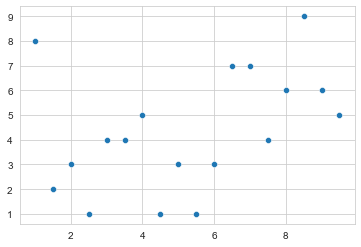
1. Seaborn scatterplot 기본
scatterplot은 기본적으로 x, y 배열을 넣어주기만 하면 산점도를 그려줍니다.
import seaborn as sns
import numpy as np

x = np.arange(1, 10, 0.5)
y = np.random.randint(1, 10, size=len(x))

sns.set_style('whitegrid')
sns.scatterplot(x=x, y=y)
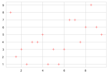
Seaborn scatterplot은 Matplotlib의 scatter 인자를 지원하므로 이를 이용하여 기본적인 산점도 색상(color), 점 크기(size), 점 모양(marker) 등을 설정할 수 있어요.
sns.set_style('whitegrid')
sns.scatterplot(x=x, y=y,
                color='r', ## 점 색상
                s=50, ## 점 크기
                marker='+' ## 점 모양
               )
2. Seaborn scatterplot 다양한 기능
1) Pandas 데이터프레임 지원
Seaborn은 Pandas 모듈의 데이터프레임 형식의 데이터를 시각화하기가 참 좋습니다. scatterplot의 data 인자에 데이터프레임을 넣고, x와 y인자에 데이터프레임이 갖고 있는 칼럼을 넣어주면 산점도를 쉽게 그릴 수 있습니다.
여기서는 Seaborn이 제공하는 Tip 데이터를 이용하여 산점도를 그려보겠습니다.
tip_df = sns.load_dataset('tips')

sns.set_style('whitegrid')
sns.scatterplot(data=tip_df, x='total_bill', y='tip')

2) 범주를 색상으로 표현(hue, hue_order)
scatterplot의 hue 인자를 설정하면 색상을 이용하여 범주를 표현할 수 있습니다. 이때 hue_order에 범주값을 갖는 리스트를 넣어주면 해당 리스트 순서대로 색상과 범례를 표시해줍니다.
tip_df = sns.load_dataset('tips')

sns.set_style('whitegrid')
sns.scatterplot(data=tip_df, x='total_bill', y='tip',
                hue='day', ## 각 요일별로 색상이 다르게 그려진다.
                hue_order = ['Sun', 'Sat', 'Thur', 'Fri'] ## 일, 토, 목, 금 순으로 색상과 범례가 표시
               )

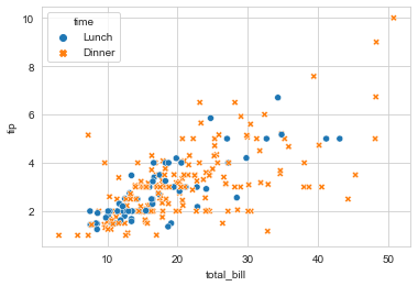
3) 범주를 모양으로 구분(style, style_order)
scatterplot의 style인자를 이용하면 범주를 모양으로 구분할 수 있습니다. style_order는 hue_order와 동일한 방식으로 작동합니다.
tip_df = sns.load_dataset('tips')

sns.set_style('whitegrid')
sns.scatterplot(data=tip_df, x='total_bill', y='tip',
                style='time', ## 각 시간대별로 모양이 다르게 그려진다.
                style_order = ['Lunch', 'Dinner'] ## 점심 순으로 모양과 범례가 표시
               )

혹시라도...
범례 색상이 산점도의 색상과 똑같지 않은 것에 대해서 불편하신 분들은 아래와 같이 해주세요.
tip_df = sns.load_dataset('tips')

sns.set_style('whitegrid')
ax = sns.scatterplot(data=tip_df, x='total_bill', y='tip',
                style='time', ## 각 시간대별로 모양이 다르게 그려진다.
                style_order = ['Lunch', 'Dinner'] ## 점심 순으로 모양과 범례가 표시
               )

marker_color = ax.collections[0].get_facecolor() ## 기존 마커 색상 추출

## 범례에 표시된 점 색상과 산점도 색상 같게 만들기
handles, labels = ax.get_legend_handles_labels()
new_handles = []
for hd in handles:
    hd.set_facecolor(marker_color) ## 마커 facecolor
    hd.set_edgecolor('none')  ## 마커 테두리 색상 제거
    new_handles.append(hd)

ax.legend(new_handles, labels, title='month')

또한 hue와 style을 같은 칼럼으로 지정하면 색상과 모양을 범주마다 다르게 할 수도 있습니다.
tip_df = sns.load_dataset('tips')

sns.set_style('whitegrid')
sns.scatterplot(data=tip_df, x='total_bill', y='tip',
                hue='time',
                style = 'time'
               )
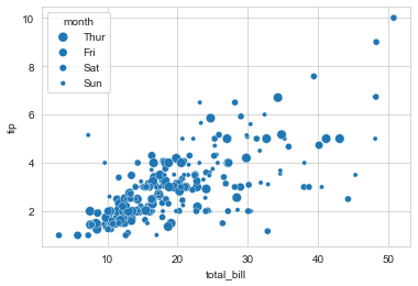
4) 범주를 점 크기로 표현(size, size_order)
scatterplot의 size인자를 이용하면 점(marker) 크기에 따라서 범주를 표현할 수 있다. size_order는 hue_order의 동작 방식과 같다.
tip_df = sns.load_dataset('tips')

sns.set_style('whitegrid')
ax = sns.scatterplot(data=tip_df, x='total_bill', y='tip',
                size='day', ## 각 요일별로 점 크기가 달라진다.
                hue_order = ['Sun', 'Sat', 'Thur', 'Fri'] ## 일, 토, 목, 금 순으로 크기와 범례가 표시
               )

### 범례와 산점도 색상 일치 ###
marker_color = ax.collections[0].get_facecolor()

## 범례에 표시된 점 색상과 산점도 색상 같게 만들기
handles, labels = ax.get_legend_handles_labels()
new_handles = []
for hd in handles:
    hd.set_facecolor(marker_color) ## 마커 facecolor
    hd.set_edgecolor('none')  ## 마커 테두리 색상 제거
    new_handles.append(hd)

ax.legend(new_handles, labels, title='month')
이번 포스팅에서는 scatterplot을 이용한 산점도 그리는 방법을 알아보았습니다. 산점도는 많이 활용되므로 알아두시면 유용할 거예요. 다음에도 좋은 주제로 만날 것을 약속드리며 이상 포스팅 마치겠습니다.

'데이터 분석 > 시각화' 카테고리의 다른 글
| [Seaborn] 5. 바이올린 플롯(Violin Plot) 그리기 (0) | 2022.08.10 |
|---|---|
| [Seaborn] 4. 박스 플롯(Box Plot) 그리기 (feat. boxplot) (0) | 2022.08.09 |
| [Seaborn] 2. 막대 그래프(바 차트, Bar Chart) 그리기 (feat. barplot) (2) | 2022.08.06 |
| [Seaborn] 1. 선 그래프(라인 차트, Line Chart) 그리기 (feat. lineplot) (0) | 2022.08.04 |
| [Matplotlib] x축, y축 끝에 화살표 추가하기 (feat. Polygon) (0) | 2022.07.17 |


댓글